Apartment Project for a Young Family
IDEA
The first thing I heard when starting to design the interior of this apartment was: “we want it to have our character.” In this project, trends and fashions didn’t matter; instead, the focus was on understanding how the characteristics of the inhabitants reflect in the interior.
The second design goal was to create an interior that would respond to the changing needs of its owners over time. Currently, it is a remote-working couple who enjoys cooking and maintains an “open house” for friends. However, they plan to have children in the future and shift to partially office-based work. It was essential to design a space that allows flexible adaptation to the needs of its residents.
The project required a deep understanding of the future occupants’ needs and a high level of sensitivity. It was a continuous dialogue between the designer and the owners, providing an opportunity to create a highly individualized interior.
Layout Change
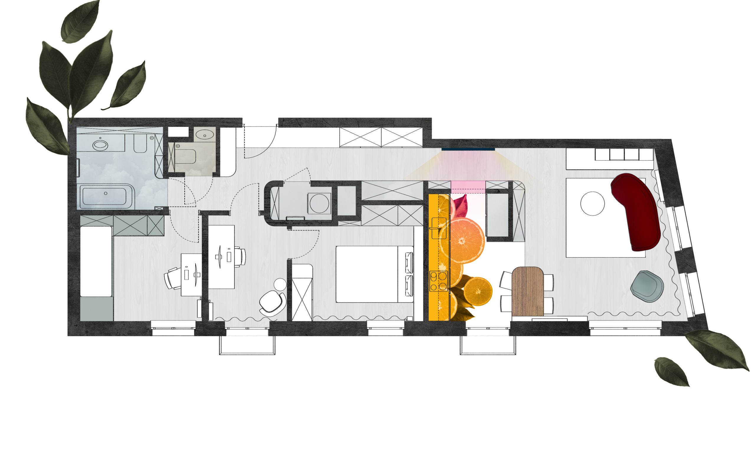
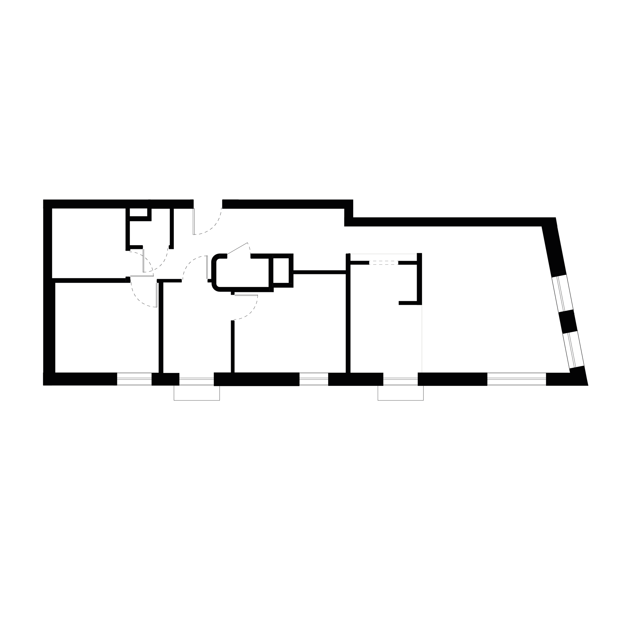
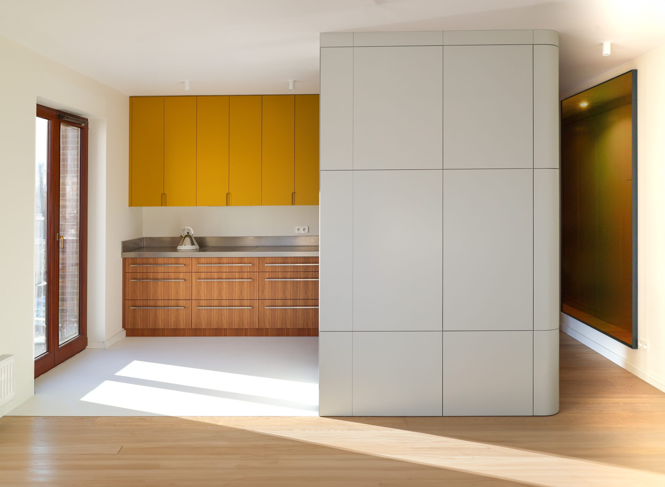
The first design challenge was to redesign the layout of this eighty-four-square-meter apartment. By changing the layout from a three-room apartment with a separate kitchen, it became a four-room apartment: two bedrooms, a study, and a living room with a kitchen area, along with an additional toilet and laundry room.
“Mebel”
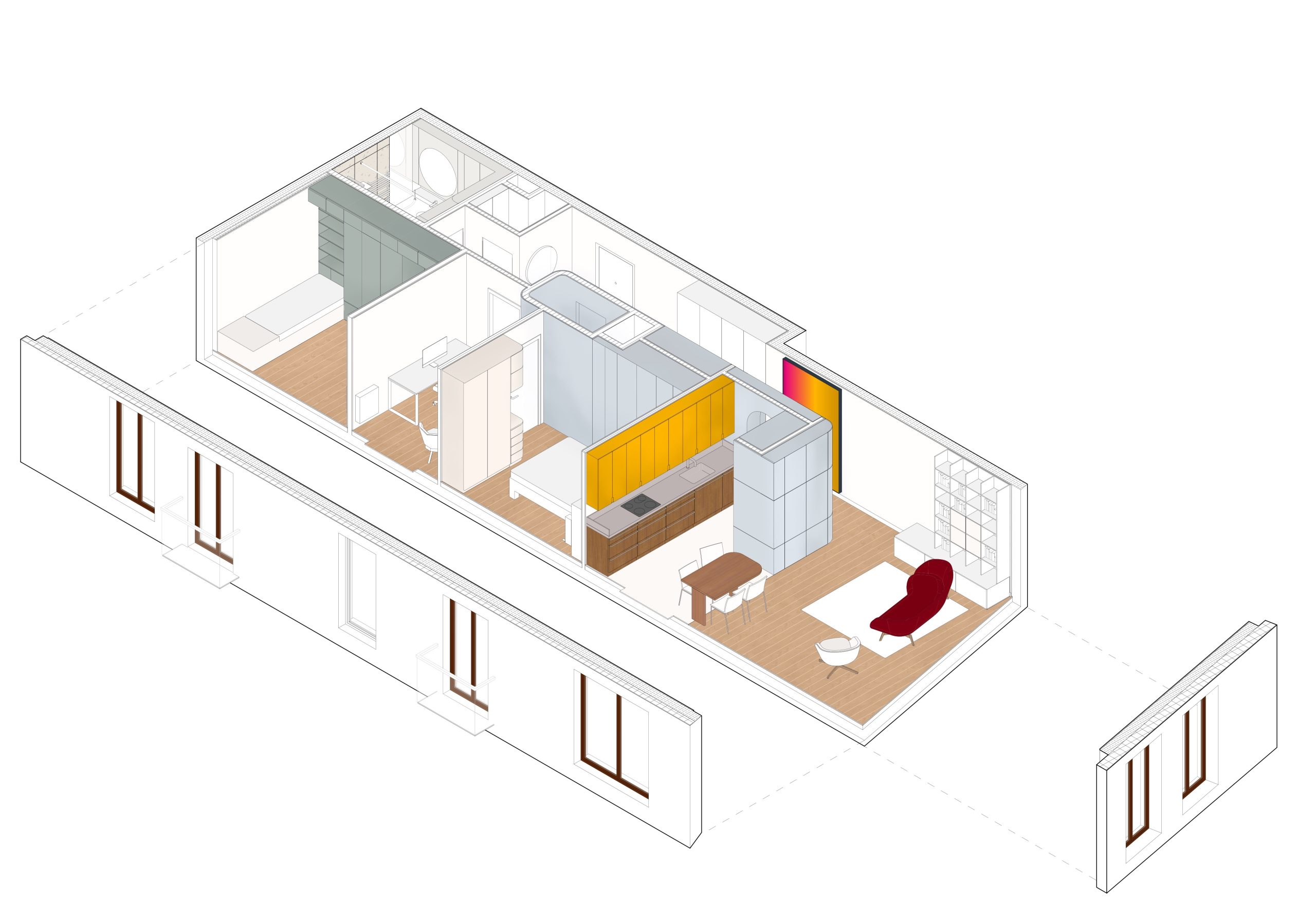
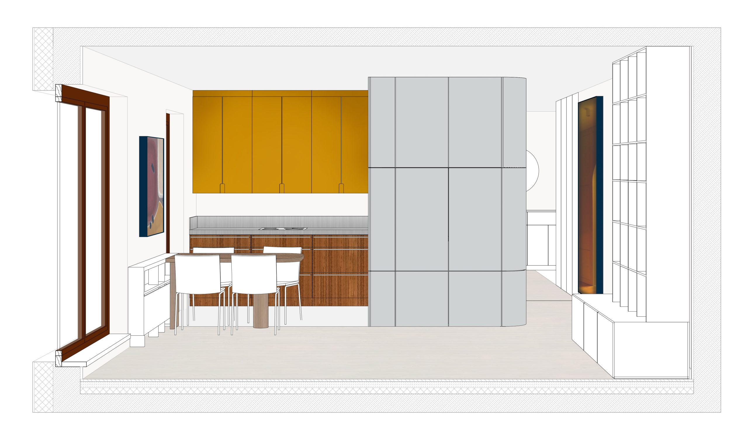
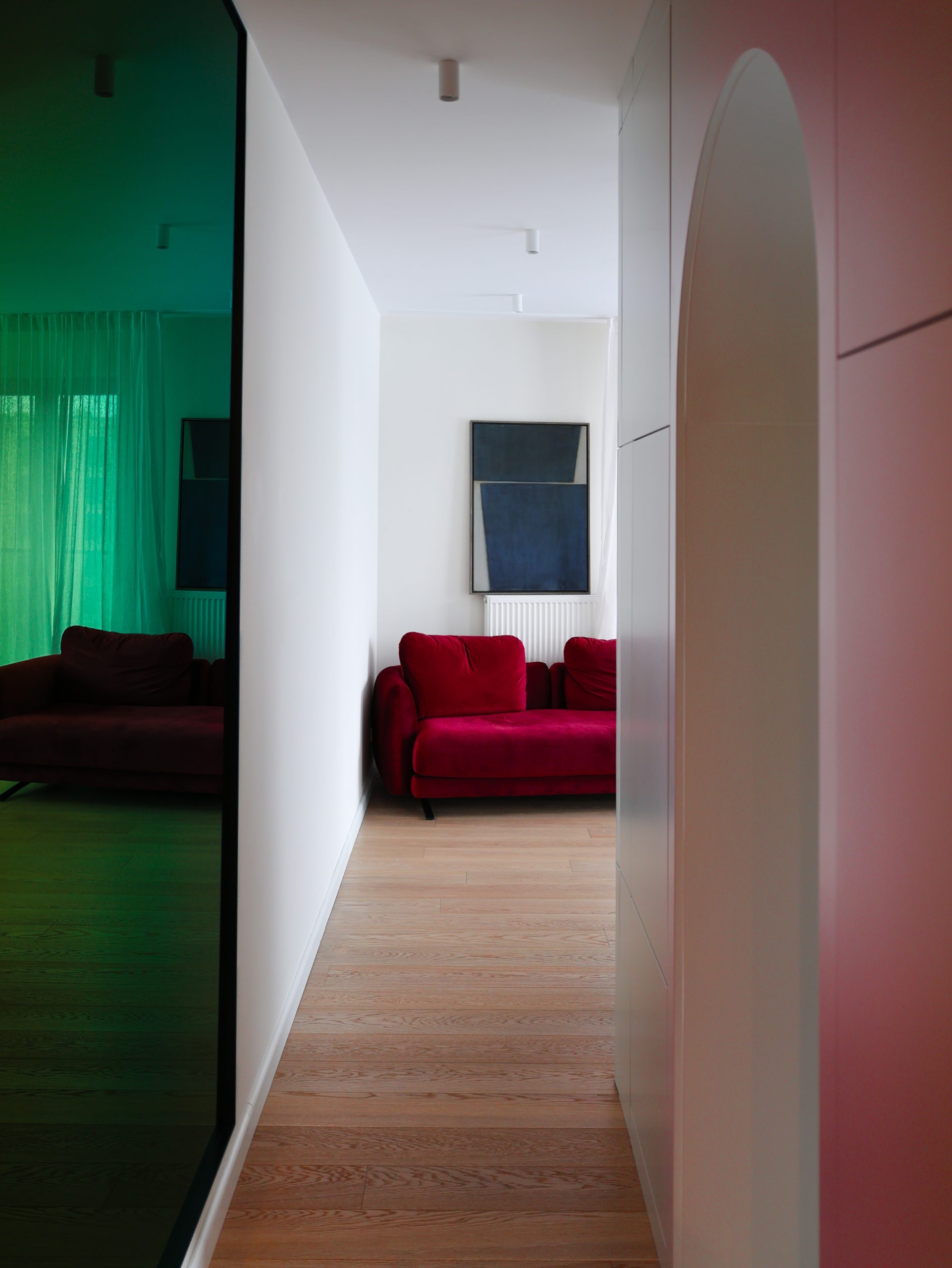
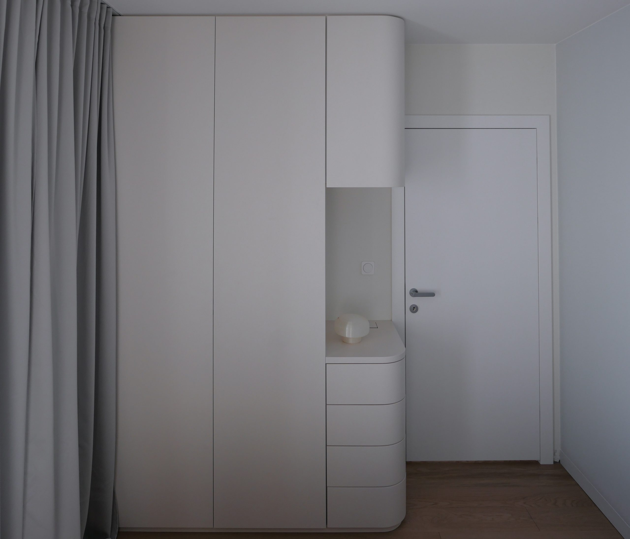
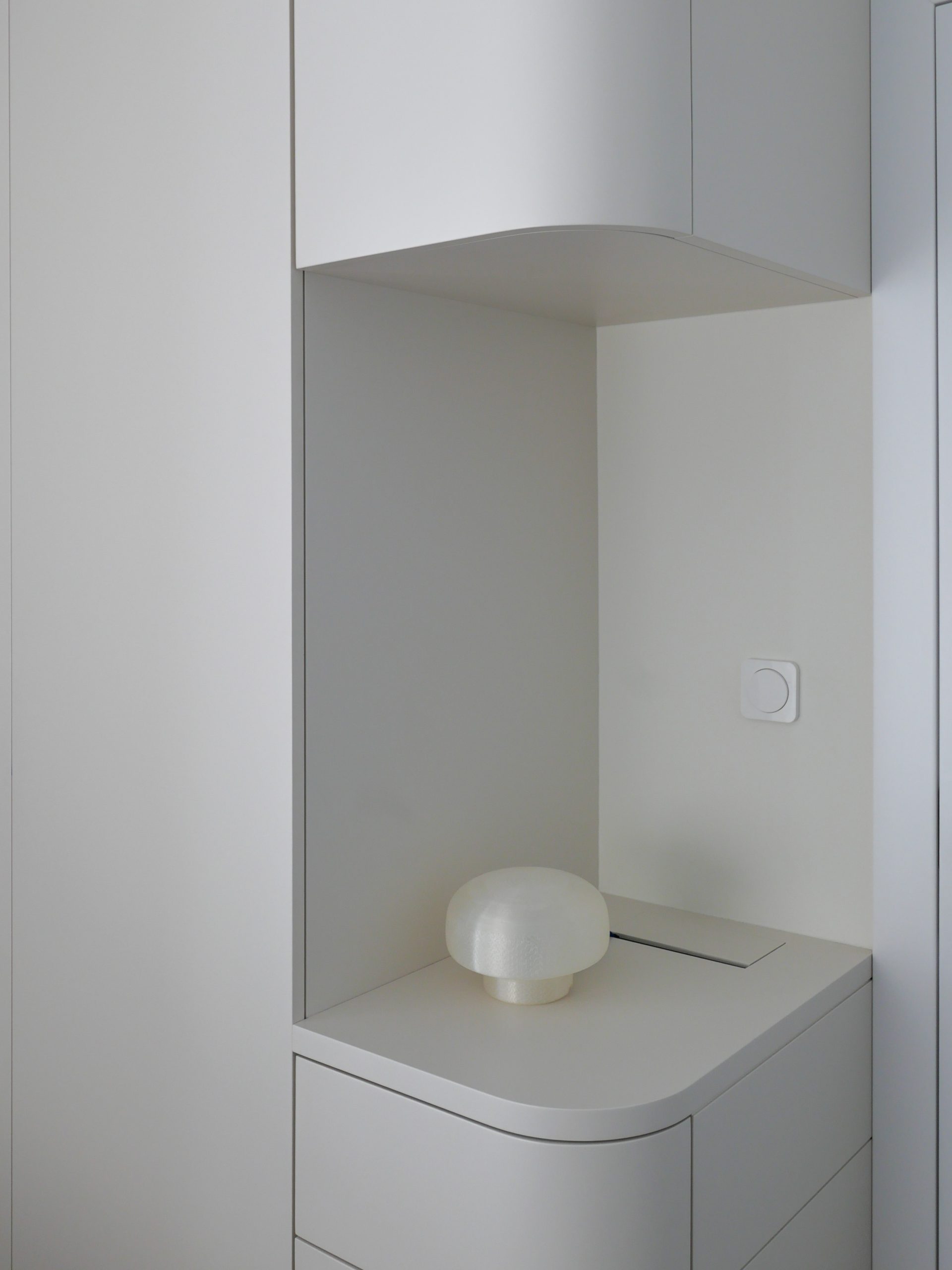
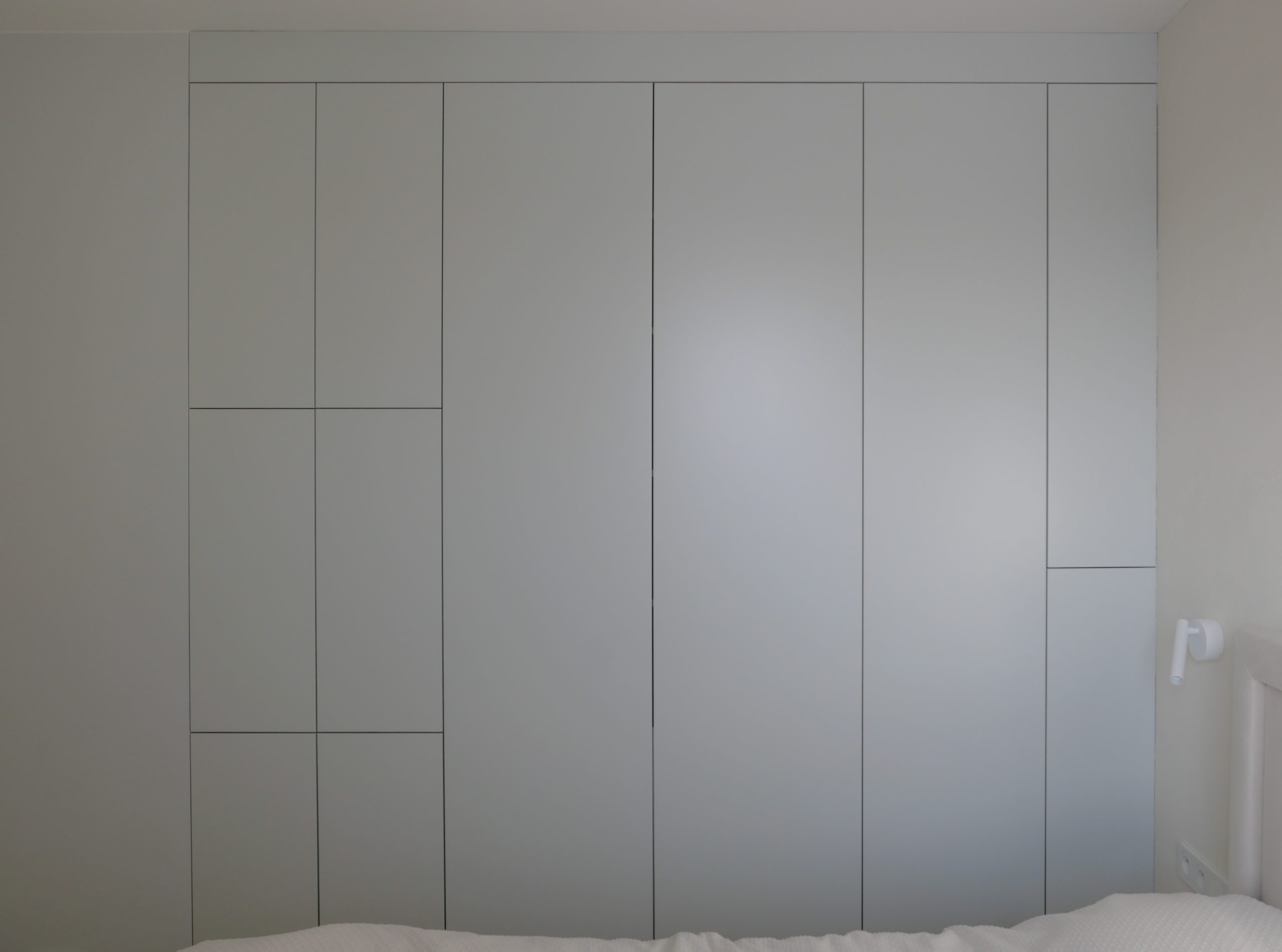
The apartment’s layout is based on a central core, which, during the project, gained the nickname “mebel.” It is a sequence of cabinets running through the central part of the apartment, concealing a small utility room inside. By using the same color throughout the surface of the “mebel,” each room harmonizes its color scheme with the others.
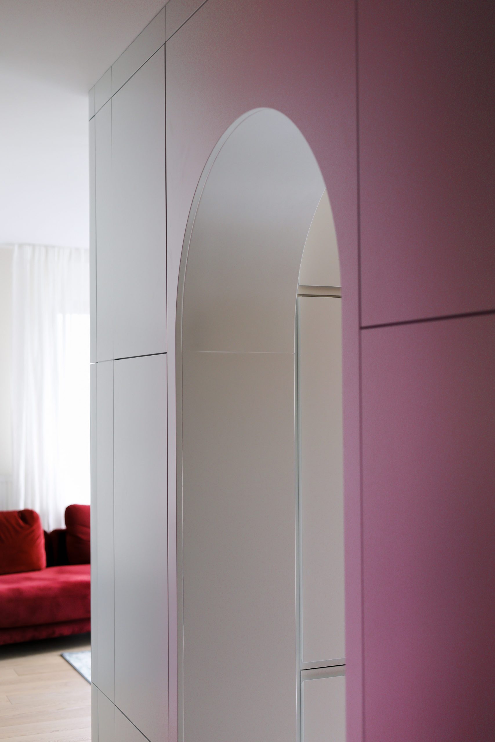
Curves
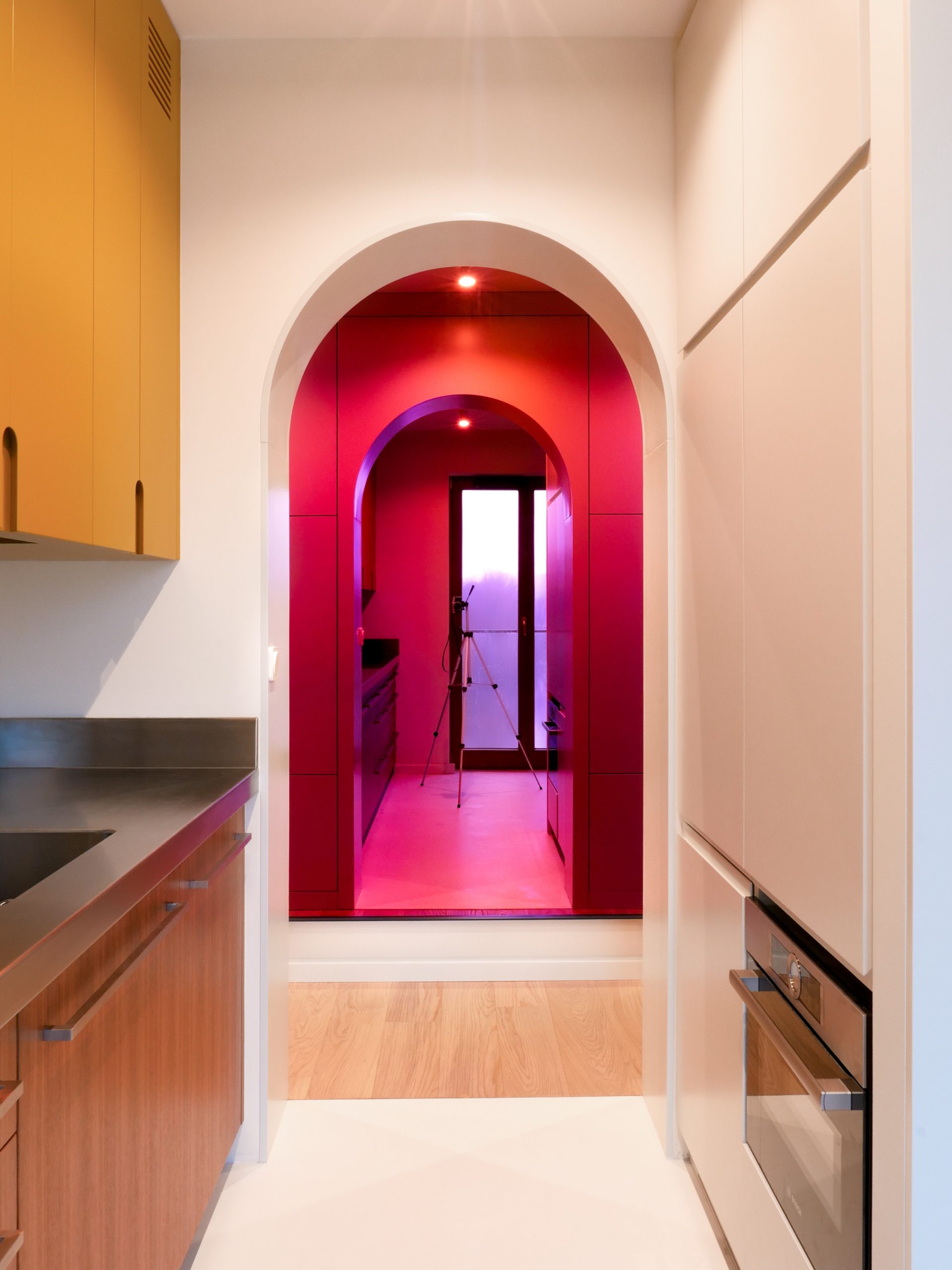
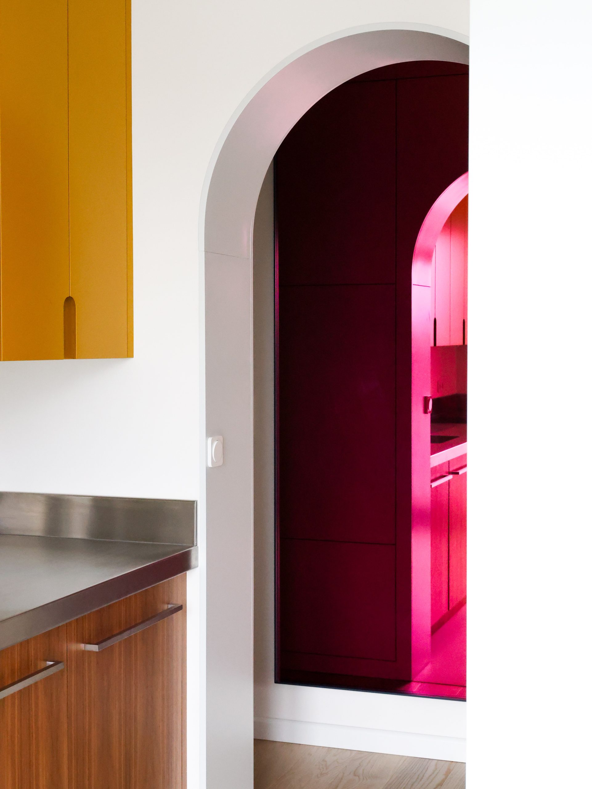
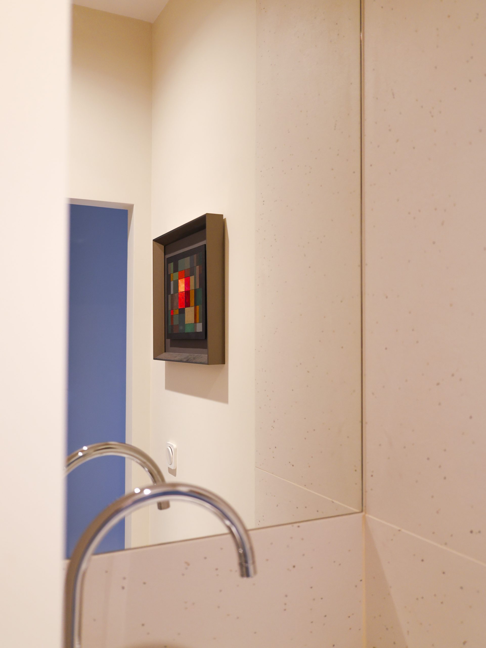
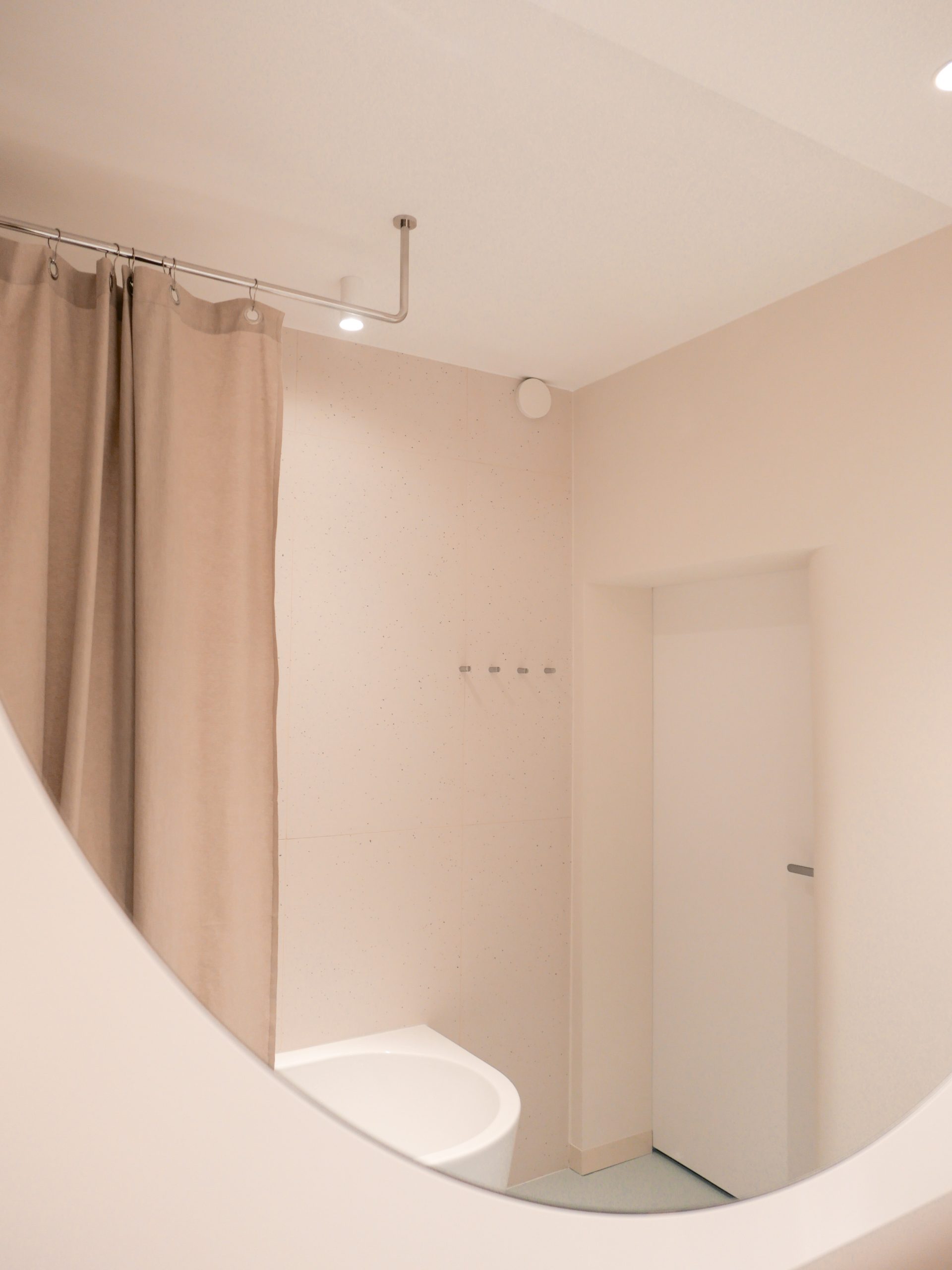
The guiding motif of the apartment is curvature. It was introduced after the layout change. Rounded corners allowed for pinpoint widening of the circulation path, making it more natural and comfortable to use. A similar approach was applied in the bathroom, where the entrance portal and the bathtub were rounded.
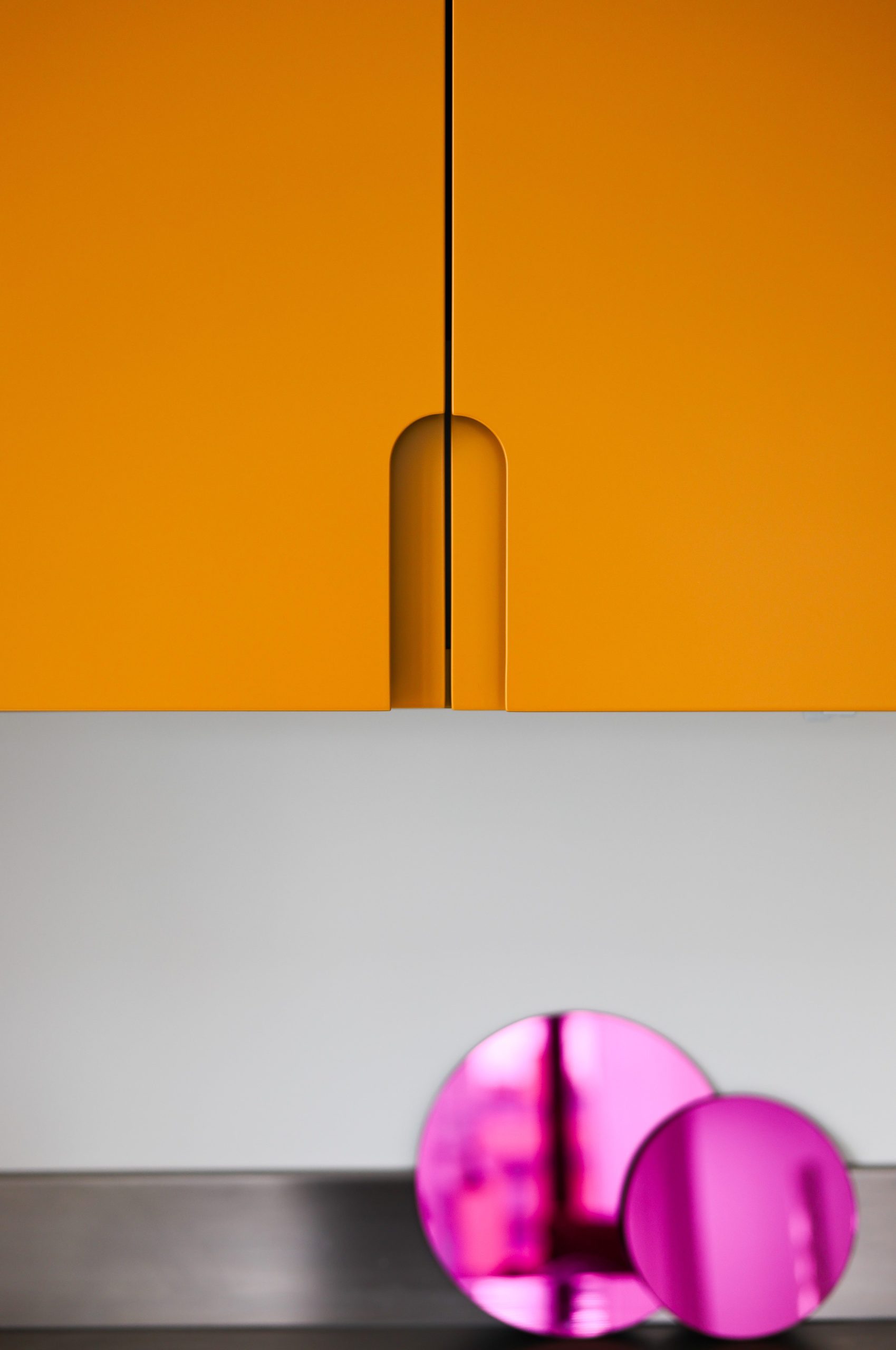
Curves were also used as a detail in the kitchen cabinet design and the dining table.
Color Scheme
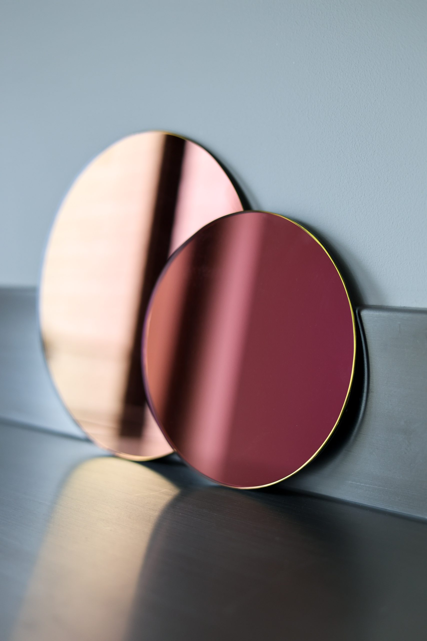
The blue-gray color of the “furniture” served as a reference point for choosing other colors. At the beginning of the design process, it was paired with a rainbow mirror that changes its color depending on the viewing angle. These two elements defined the color scheme for the entire apartment.
The yellow color used on the kitchen cabinets is the same shade as the rainbow mirror when viewed from the living room, facing the kitchen. When standing in the kitchen, the mirror reflects magenta, corresponding to the intense red color of the sofa. Sitting on the sofa, the mirror takes on a dark green hue, harmonizing with the color of the wooden table and the hallway cabinetry.
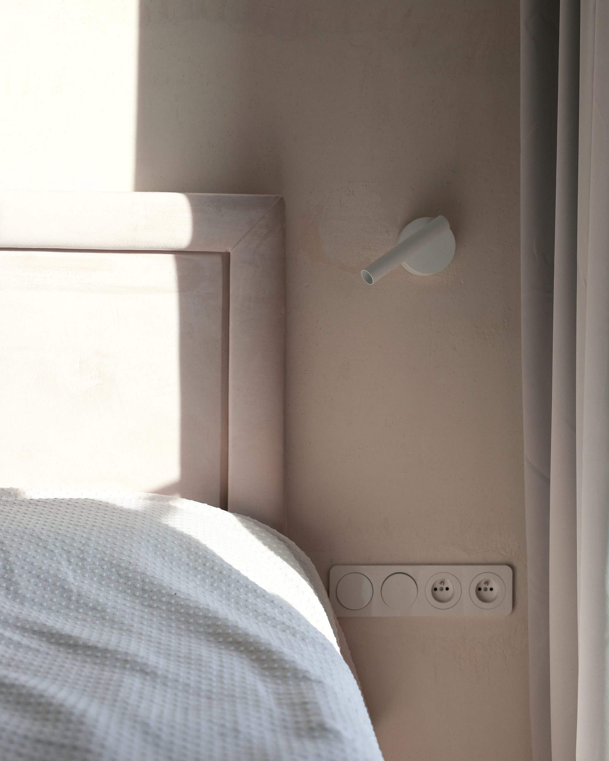
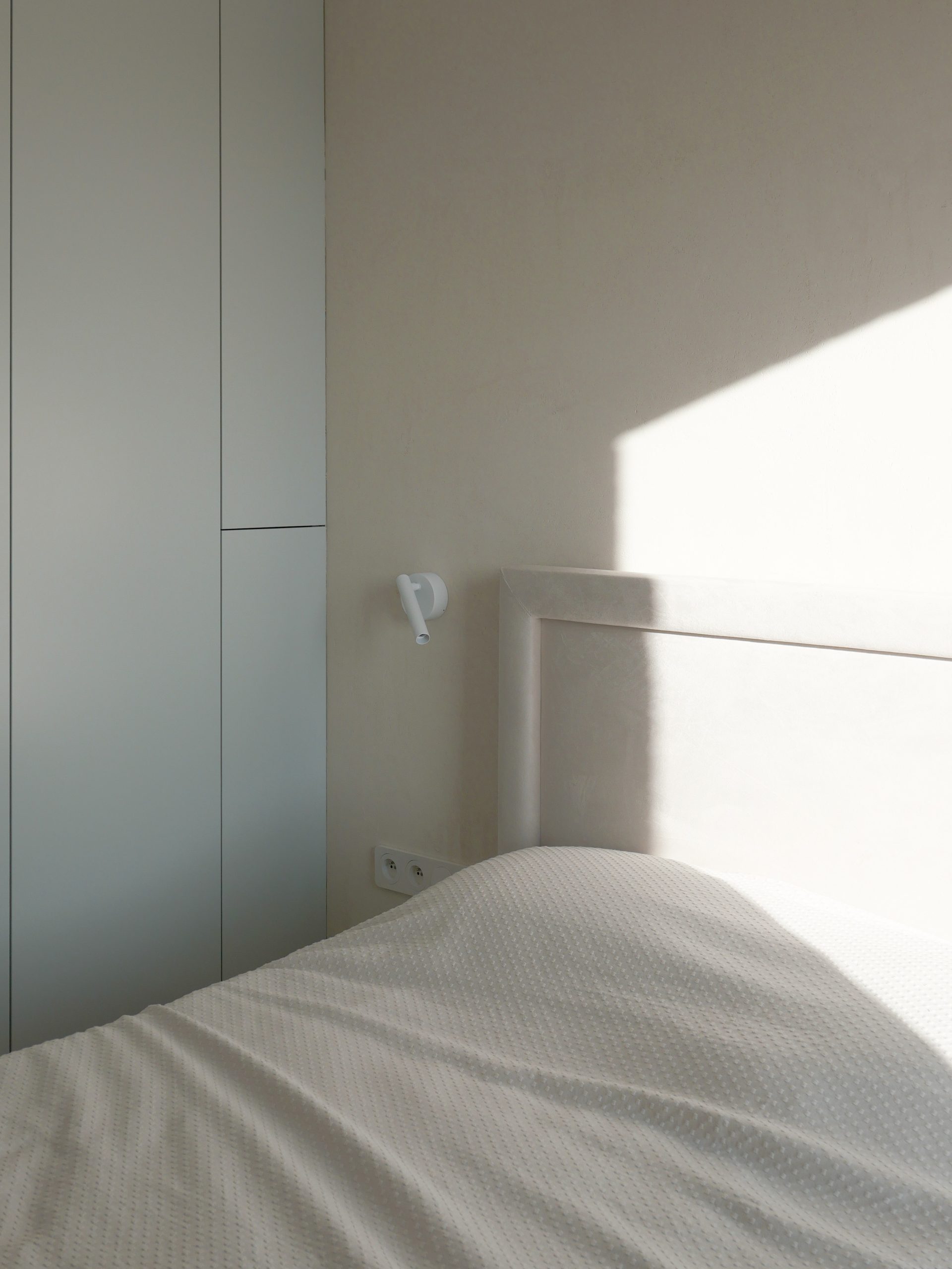
All colors used in the project have a similar color depth. Their saturation decreases depending on the room’s function: hence, the bedrooms are kept in low-saturation colors conducive to relaxation.
Materials
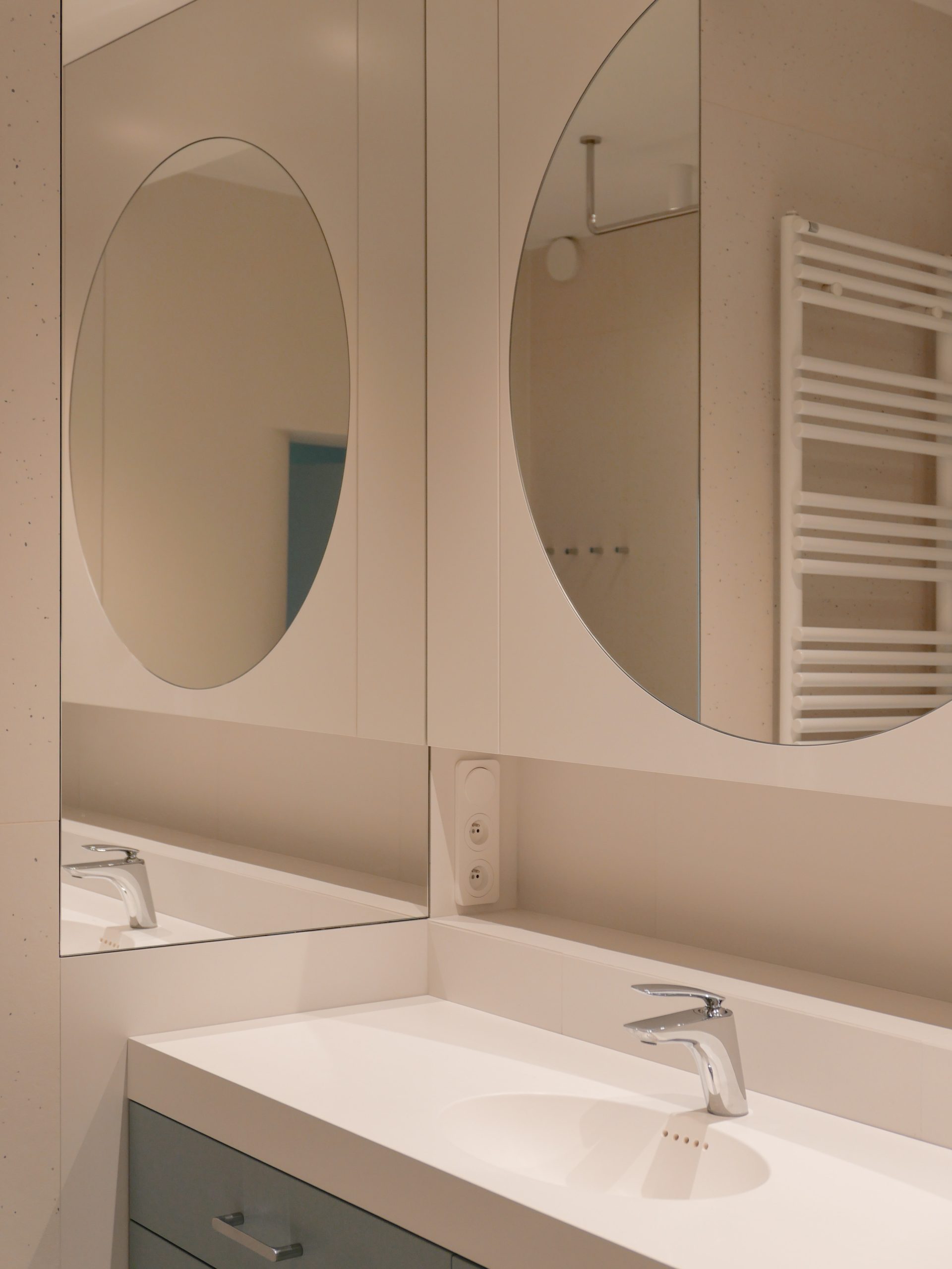
The materials used in the project were meant to be contemporary yet timeless. Floors in the rooms, hallway, and living room are finished with natural oak wood. The kitchen, bathrooms, laundry, and hallway feature a matte polyurethane resin floor.
The investors’ dream was to have a steel kitchen countertop and cabinets finished with wood.